A comprehensive evaluation of ESPN’s user interface, identifying key usability issues and providing recommendations to improve navigation, content structure, and overall user experience.
Bristol, CT
1979
Sports Entertainment
$16 billion (2022)
4,500+
Challenge
The main challenge was that users struggled to find the content they were looking for on ESPN’s platform, often feeling overwhelmed by intrusive video ads and cluttered navigation. Our goal was to streamline the user experience by enhancing the site’s navigation, reducing ad intrusiveness, and making it easier for users to access desired content quickly.
Results
The heuristic evaluation provided clear insights into key usability problems, leading to specific recommendations aimed at improving navigation and reducing ad intrusiveness. These suggested changes were designed to enhance the platform’s accessibility and usability, making it easier for users to find content without unnecessary interruptions.
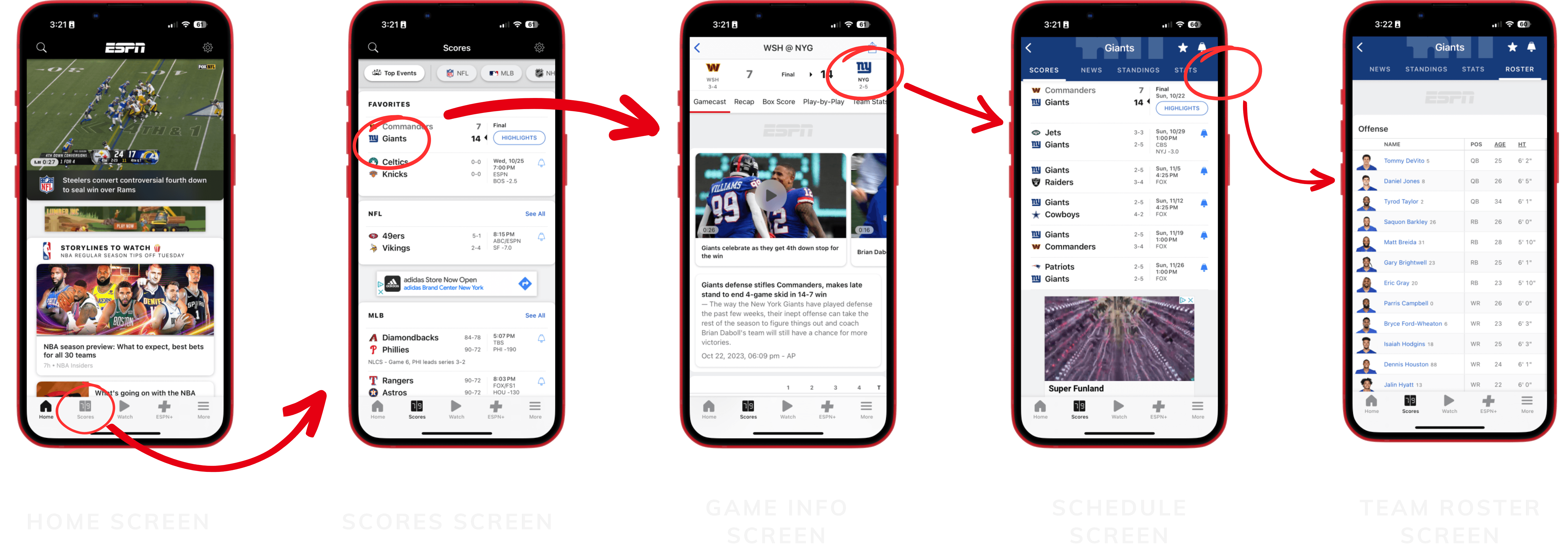
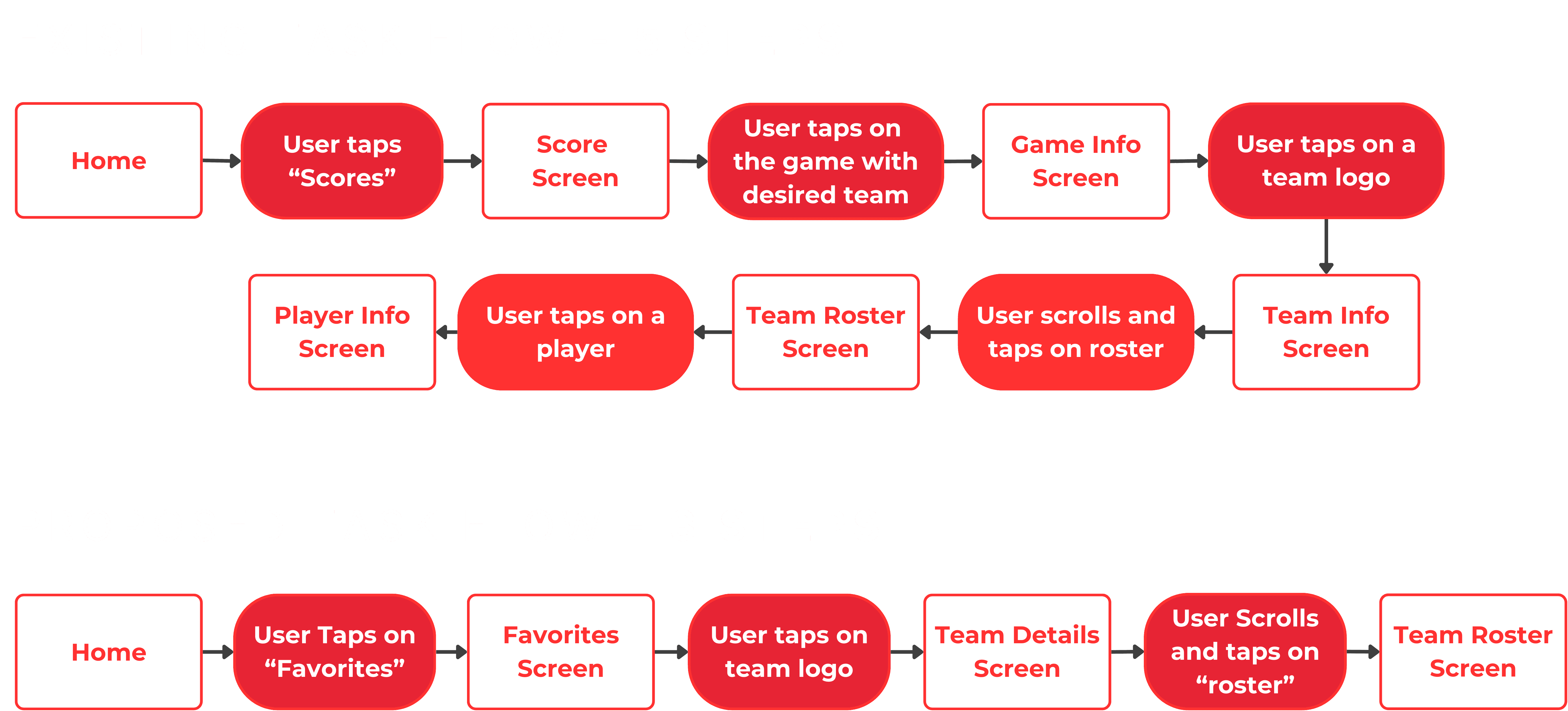
Current Task Flow
User Task: Navigate to their favorite team's roster so they can see if a key player is injured
Home Screen: User Control + Freedom: 2/5
Usability Issue: Users have to click into the video in order to pause.
Design Suggestion: Add play/pause capabilities on the main screen.
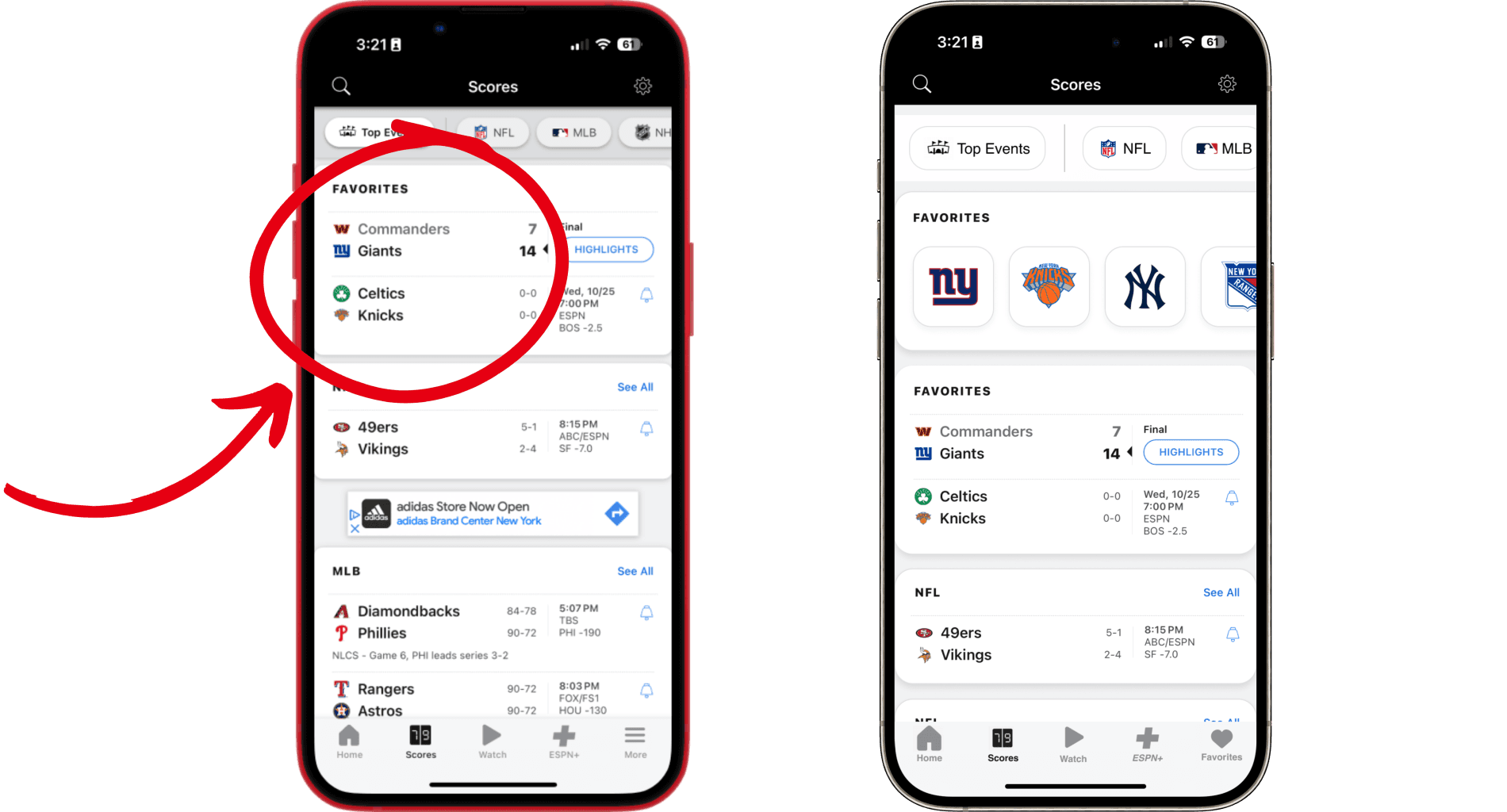
Score Screen: Visibility and System Status: 4/5
Usability Issue: Users don't have the ability to see or add to the teams that they have favorited.
Design Suggestion: Add icons for all the teams that the user has currently favorited. They can also quickly access their team by clicking on them
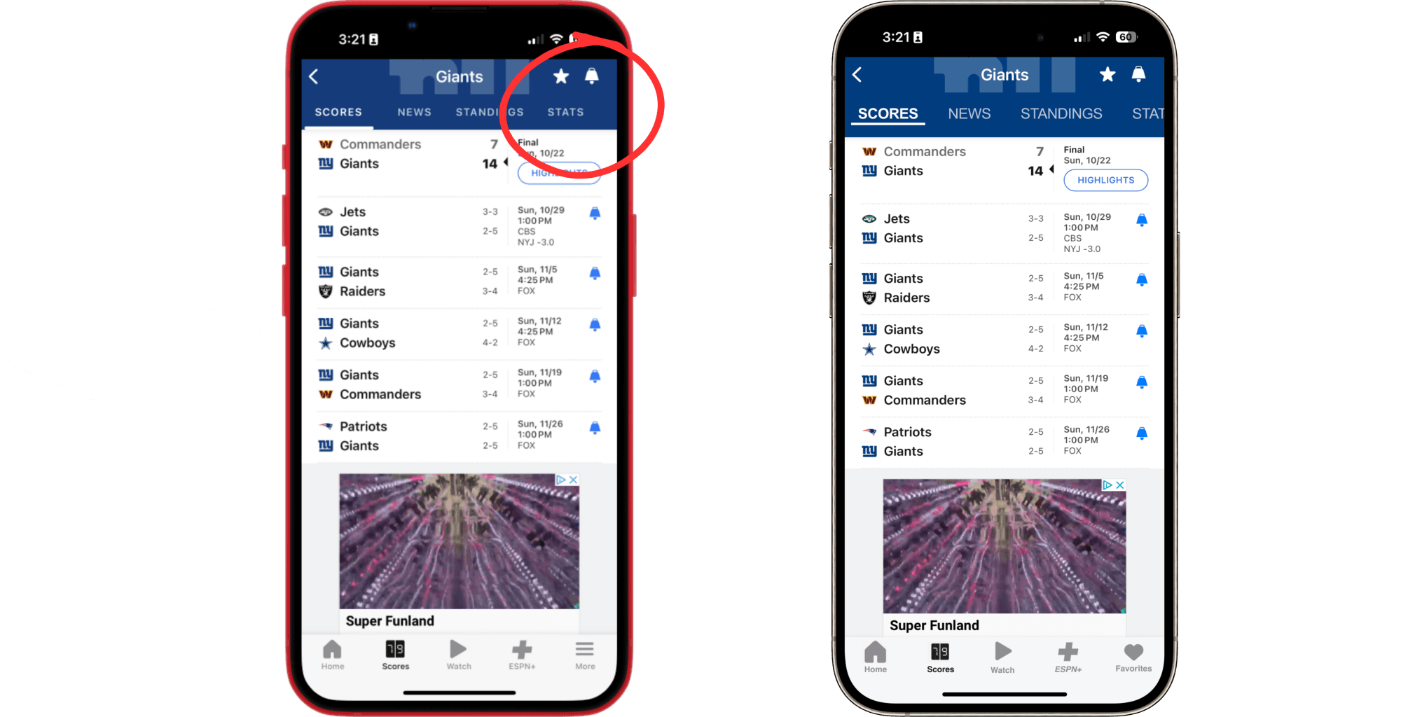
Usability Issue: There is no indication that the navigation bar at the top is scrollable. This hides the roster from the user's view.
Design Suggestion: I would recommend that one-line of text in the navigation bar be cut by the page, indicating that the top navigation bar is scrollable.
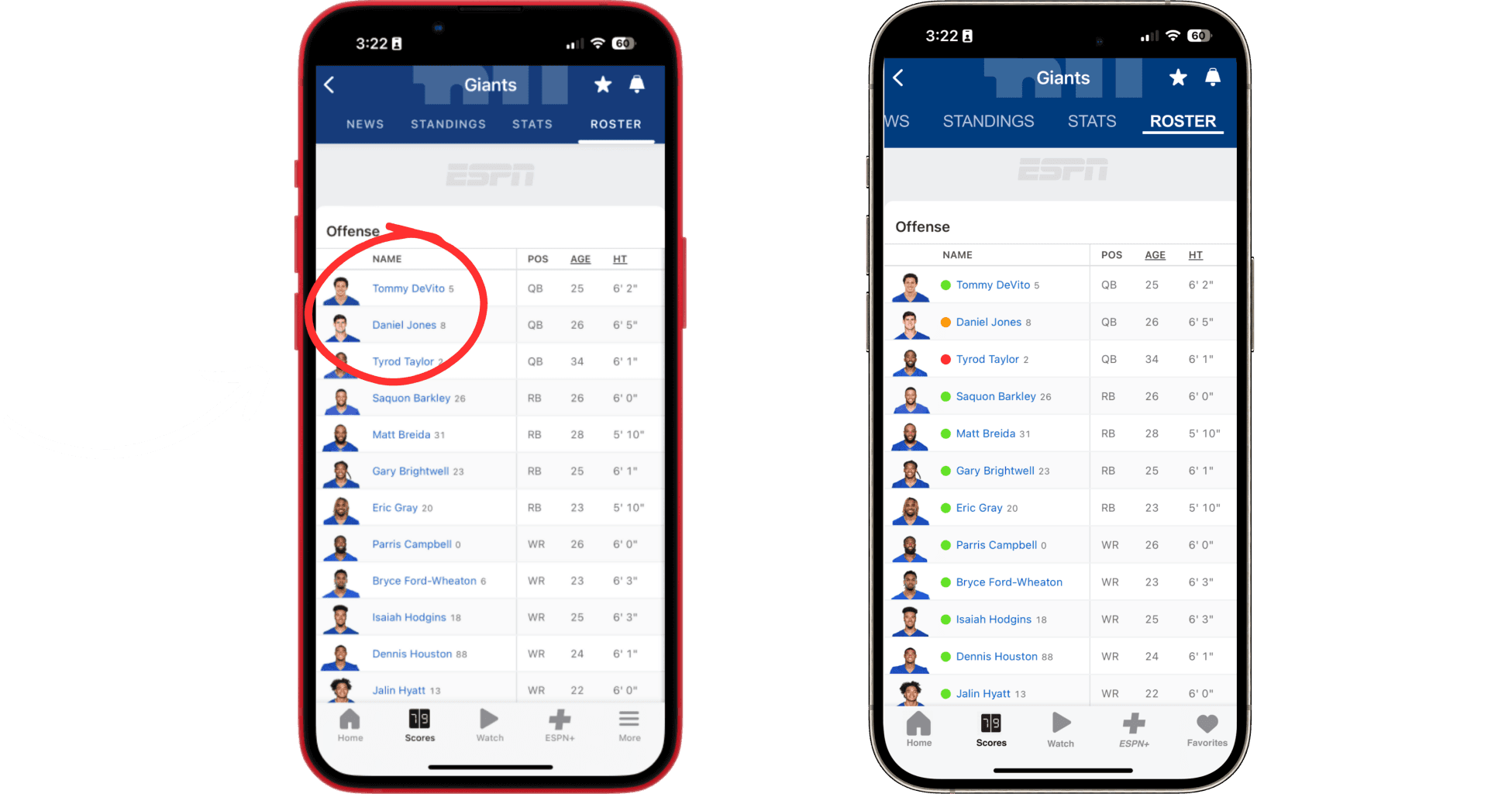
Usability Issue: There is no indication of whether or not a player is out or questionable. The user has to go to the player profile screen to find this information
Design Suggestion: We would suggest using red, orange, and green icons next to each name. This would be consistent with other sports apps so accessible to your user.
Overall Grade
The ESPN app scored an average of 2.28/5 based on the heuristic evaluation. Key issues include poor user control, difficult navigation, and inconsistent user interface elements, contributing to a less-than-optimal user experience.
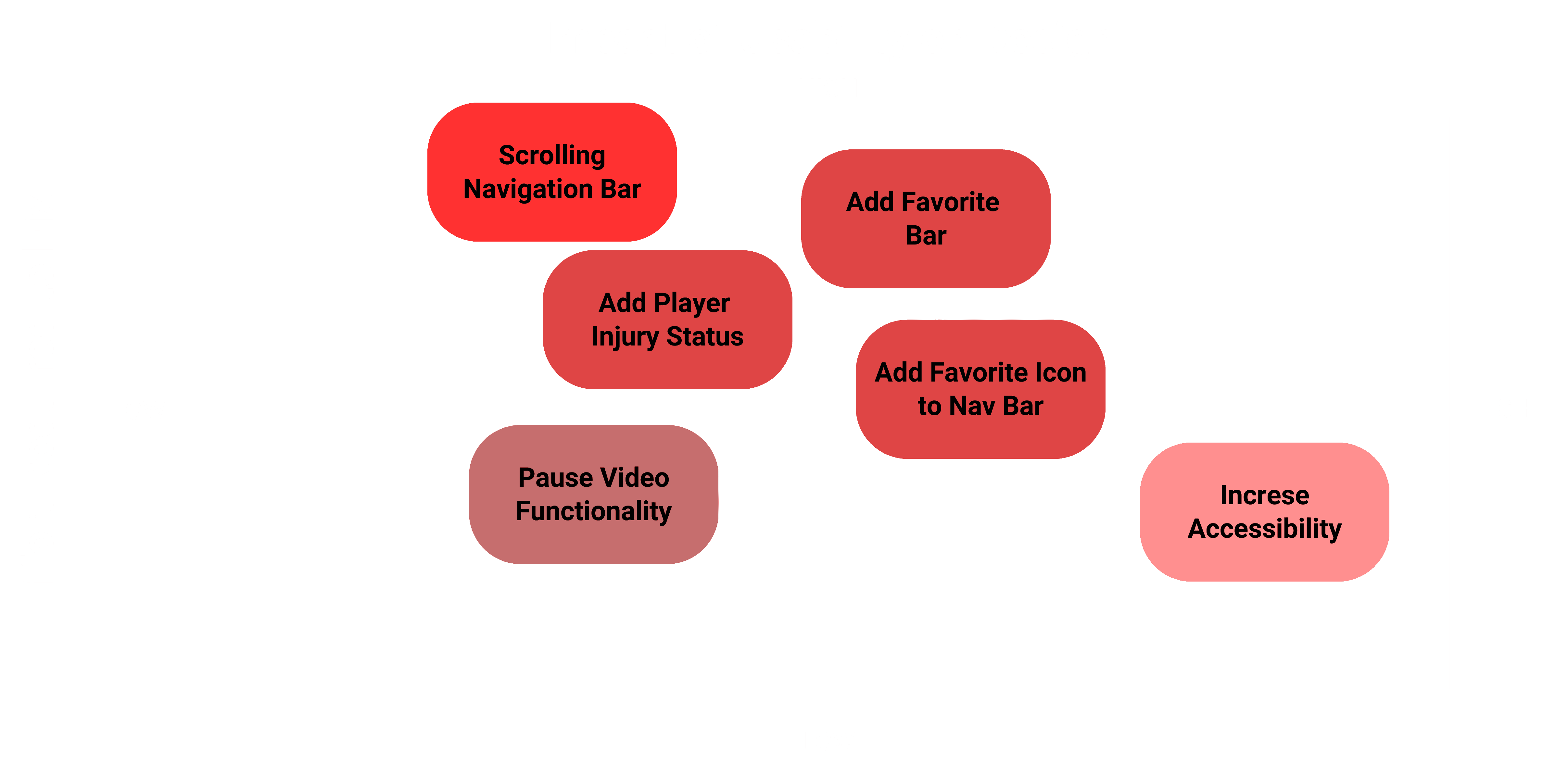
Design Prioritization Matrix
The matrix prioritizes changes by usability impact and effort, with tasks like adding player injury status ranked higher due to low effort and high impact.
Streamlined Task Flow Comparsion
The new task flow reduces user interactions from 5 steps to 3, improving navigation efficiency and simplifying access to key information, such as team rosters and player details.
Key Advantages
Optimizing the platform leads to increased user engagement, improved retention rates, and higher ad revenue, driving both user satisfaction and business growth.
Conclusion
The evaluation of the ESPN app highlighted the need for enhanced usability and a more streamlined user experience. By identifying key areas for improvement, such as navigation, accessibility, and user engagement, we were able to propose targeted solutions that optimize the app’s functionality. These adjustments have the potential to increase user satisfaction, retention, and overall engagement, showcasing the importance of user-centered design in the competitive landscape of sports apps.

